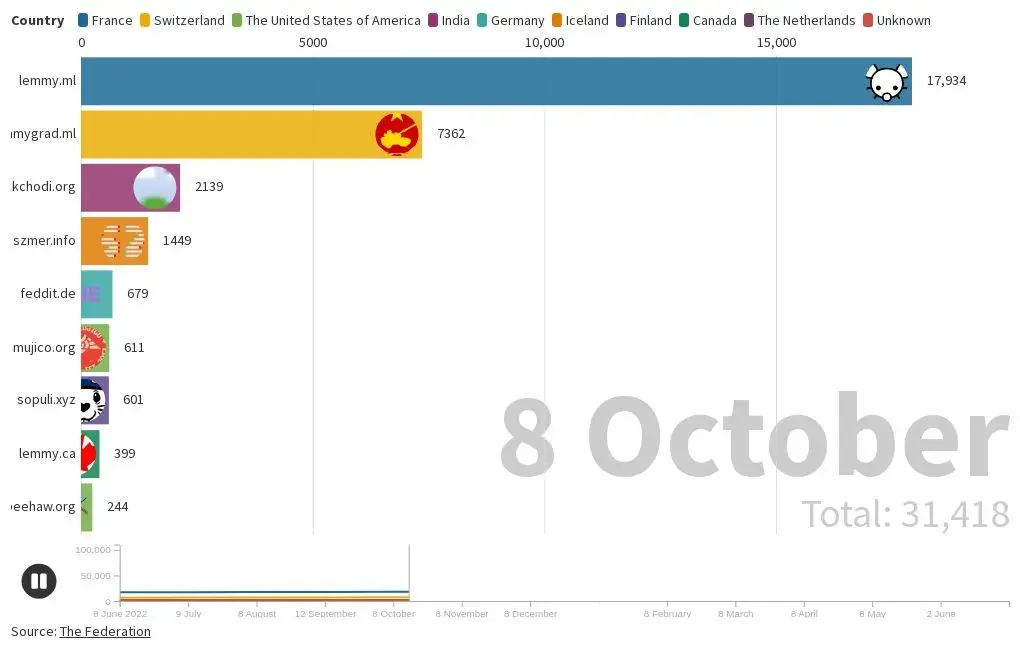
Two timelines I created of the total users at the top 10 Lemmy instances as a bar chart race and as a line chart. The line chart only includes the current top 10 Lemmy instances as of the 9th of June 2023 because Flourish only allows ten lines at a time.
I used the Federation to determine the current top 10 Lemmy instances as of the 9th of June and the 14th of July 2023. The website only has sorting function for the current data, and the instances have to opt in to be included. Therefore, it is likely that some instances are not included. Furthermore, the website seems to only contain data from the last year, so the website do not have documentation on the top instances prior to this period. Additionally, I excluded instances that have had quick growth in total users but not in posts and comments.
Wow beehaw really took off recently huh?
What this doesn’t show is active users, just total. For quite some time we’ve been one of the most active large instances. I don’t remember the exact timing, but we’ve held the spot of 3rd most active for some time, we just now have total users to match that.
Is there a time-series plot version of this? I always have difficulty really absorbing the data when it is animated like that.
deleted by creator
Is it possible to message on mastodon and peertube with lemmy (or is it only through kbin currently)? I was trying to figure out how that worked but had some difficulty
deleted by creator
Yeehaw Beehaw!


