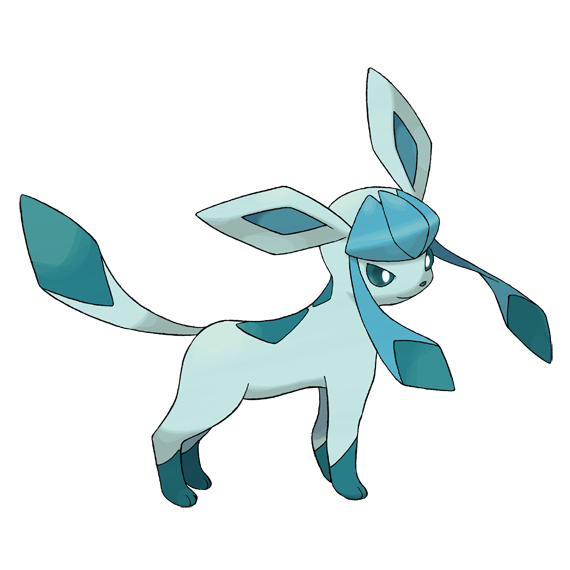
Uh, work’s a little slow today, so here’s what I thought the Lemmy logo would look like at a 45 and 90 degree rotation. I have the .svg file, if anyone wants. Or just screenshot, w/e
true piece of art
he’s fkin cute, I had to do it
It actually looks better at an angle.
The default logo is just ugly
Not surprised. Experienced designers tend not to contribute to early stage OSS. Only recently did all the graphic and UX designers flood over to the project.
He almost looks like he could be animated in the Hello Kitty world
Oh yeah, complete with no explicit emotion. The reddit alien was smiling.
The advantage Kitty-chan holds is her lack of a mouth. The reason for this is summed up best by Yuko Yamaguchi, the current character designer (meaning “boss”) of Hello Kitty:
“[She doesn’t have a mouth] so that people who look at her can project their own feelings onto her face, because she has an expressionless face. Kitty looks happy when people are happy. She looks sad when they are sad. For this psychological reason, we thought she shouldn’t be tied to any emotion – and that’s why she doesn’t have a mouth.”
The power of Hello Kitty’s interpretation now extends a layer deeper, beyond our idea of what she represents into our idea of what she is feeling. This gives her life in our minds, in a way that “mouthed” cartoons can’t. What Mickey Mouse is feeling at any given moment, not counting his situation or environment, can be clearly seen through his mouth. Hello Kitty, lacking this feature, could be feeling anything at any time! And thus whatever we may be feeling can and probably does get transferred onto her face.
TIL
Thank you!
That’s… actually quite interesting. I wonder how true the part about projecting current emotions on it is. I never see it as anything, but an emotionless face.
90 degree lemmy could be a little bird too

Anyone crazy enough to draw these like the memes?
3d rotating lemmy when?
Close enough


